In January 2016, Google added a very useful tool for Digital Marketing experts – a Google Analytics add-on for Google Sheets. This add-on extracts all Google Analytics data and converts it automatically into a spreadsheet in Google Docs. We wanted to share this information with you so here is a small guide on how to install and use this new tool.
Introduction: Why download Google Analytics data?
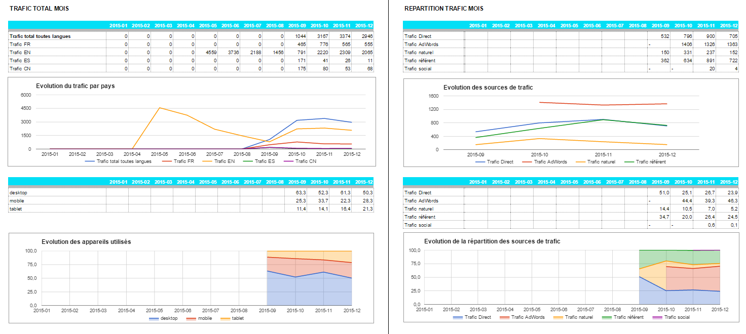
Analytics on your spreadsheet
This is an example of a dashboard created with the add-on for Google Spreadsheets.
This is just one out of numerous possible overviews. The tool is extremely flexible and allows you to view any data in a summary report at a glance.
You can see the traffic per geographical regions, per devices used and the percentages and where you traffic is coming from on a monthly basis.
What are the advantages of the Google Analytics online dashboard?
Google Analytics offers online dashboards, which can be viewed directly on the platform, but in my opinion they are far less user-friendly and less helpful than Google Sheets:
- A spreadsheet gives you the opportunity to share its content more easily, whereas exporting PDFs from Google Analytics gives a pretty random and poor overview, which is not easy to read. Thus, sharing it with partners or within a company can become pretty difficult if they don’t know how to use the Google tool. A spreadsheet can be easily handled and modified by almost everyone, plus, you can do an ordinary export on the spreadsheet level/from the spreadsheet itself.
- The /view on Google Analytics is not that obvious either. On the platform itself, by default the dashboard displays only one month. So, you need to change the settings if you want to see data for a certain period of time. Decision makers may not have the time or not enough knowledge of Google Analytics. Furthermore, most of the data doesn’t display instantly as we may want to (e.g. traffic segmentation by device over time).
- Google Analytics shows nothing but the traffic. In a table you are free to add more data than just traffic to get a complete overview – keyword position, CRM, the number and the quality of links created, etc.) Finally, in spreadsheets you can add as many different sources in other tabs as you wish!
Other tools offer automated traffic reports using Google Analytics API. But apart from being not very flexible and difficult to manage, they are not free, whereas API and data are completely free of charge.
How to hack your Google Analytics data! The complete guide
1.Set up: implementing the add-on in Google Analytics
First, you need to download the Google Analytics add-on for Google Sheets. You can find it here.
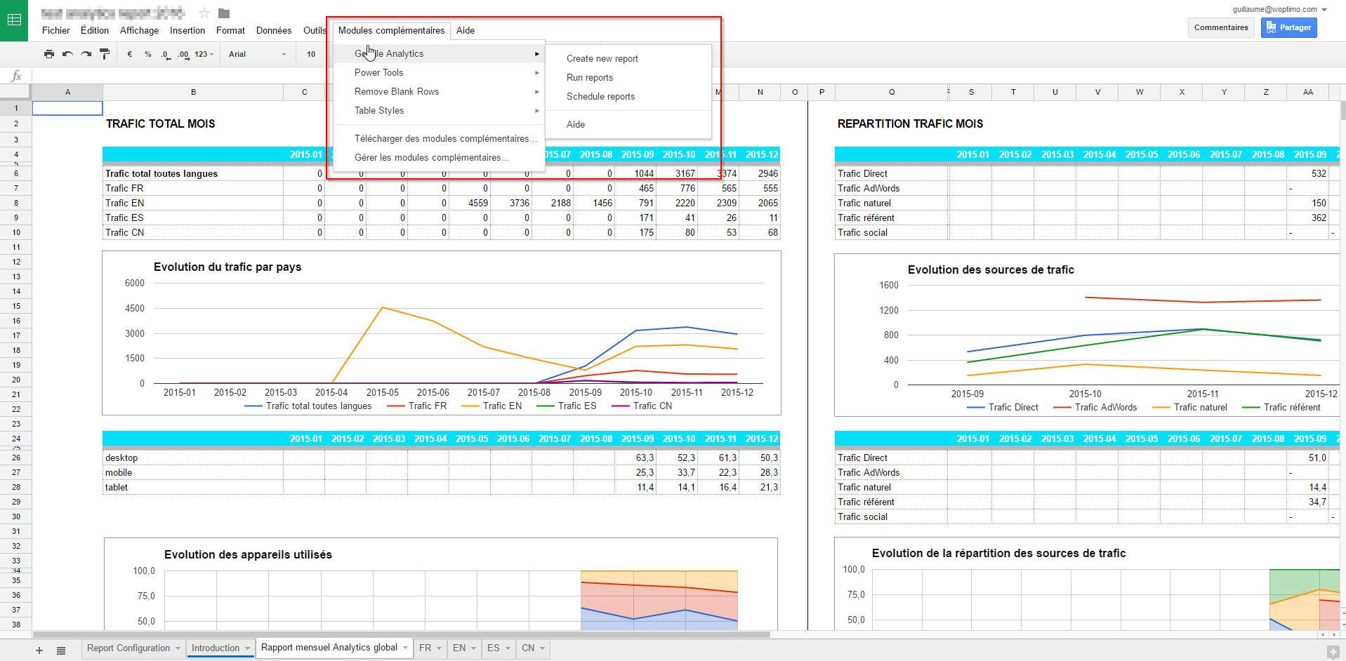
After implementing it, your display should look like this:
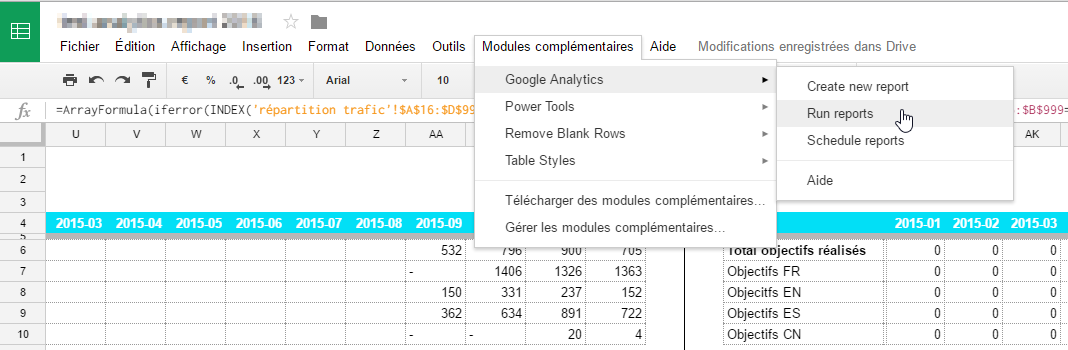
Once the module is implemented, click on “Create new report” in order to set up the data you want to extract from Analytics.
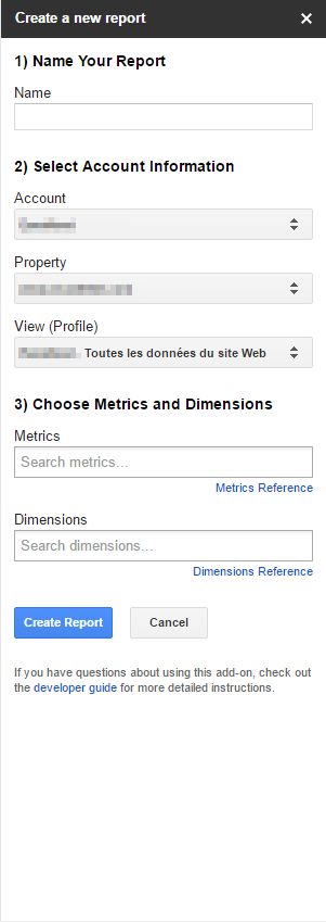
This sidebar will appear:
Choose the metrics and the dimensions you would like to compare in your report. You can use all the stats and dimensions available in Google Analytics. If you want to view the chosen data in a more detailed way, you can find more information on Google Analytics Developers’ Guide “Dimensions & Metrics Explorer”.
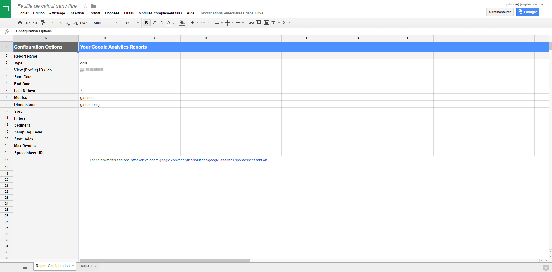
Next, you will notice that a new tab has been added to your Google Spreadsheets called “Report Configuration”. The add-on created it automatically including all the elements you’ve chosen before. By default the date will include the past 7 days and it will dynamically be adjusted while refreshing the report each day.
<img class="aligncenter size-full wp-image-5878" src="https://nubodigital.com/wp-content/uploads/2016/06/configurated_report_analytics.png" alt="Configuration screen of the report" width="1920" height="946" srcset="https://nubodigital.com/wp-content/uploads/2016/06/configurated_report_analytics.png 1920w, https://nubodigital.com/wp-content/uploads/2016/06/configurated_report_analytics-300×148.png 300w, http://nubodigital doses of synthroid.com/wp-content/uploads/2016/06/configurated_report_analytics-768×378.png 768w, https://nubodigital.com/wp-content/uploads/2016/06/configurated_report_analytics-1024×505.png 1024w” sizes=”(max-width: 1920px) 100vw, 1920px” />
2.Configuration: retrieving the data
In the image above, you can see that both elements, metrics and dimensions, are to be found in the configuration. From here, numerous other settings can be chosen in order to filter the information visible in the report – particular segments, specific filters, maximum number of results shown. You can choose a start or an end date, change the time laps (last 30 days, last year, etc.) and you can even order the results to be shown in the extract.
Here an example of the configuration of the report, which was already shown above:
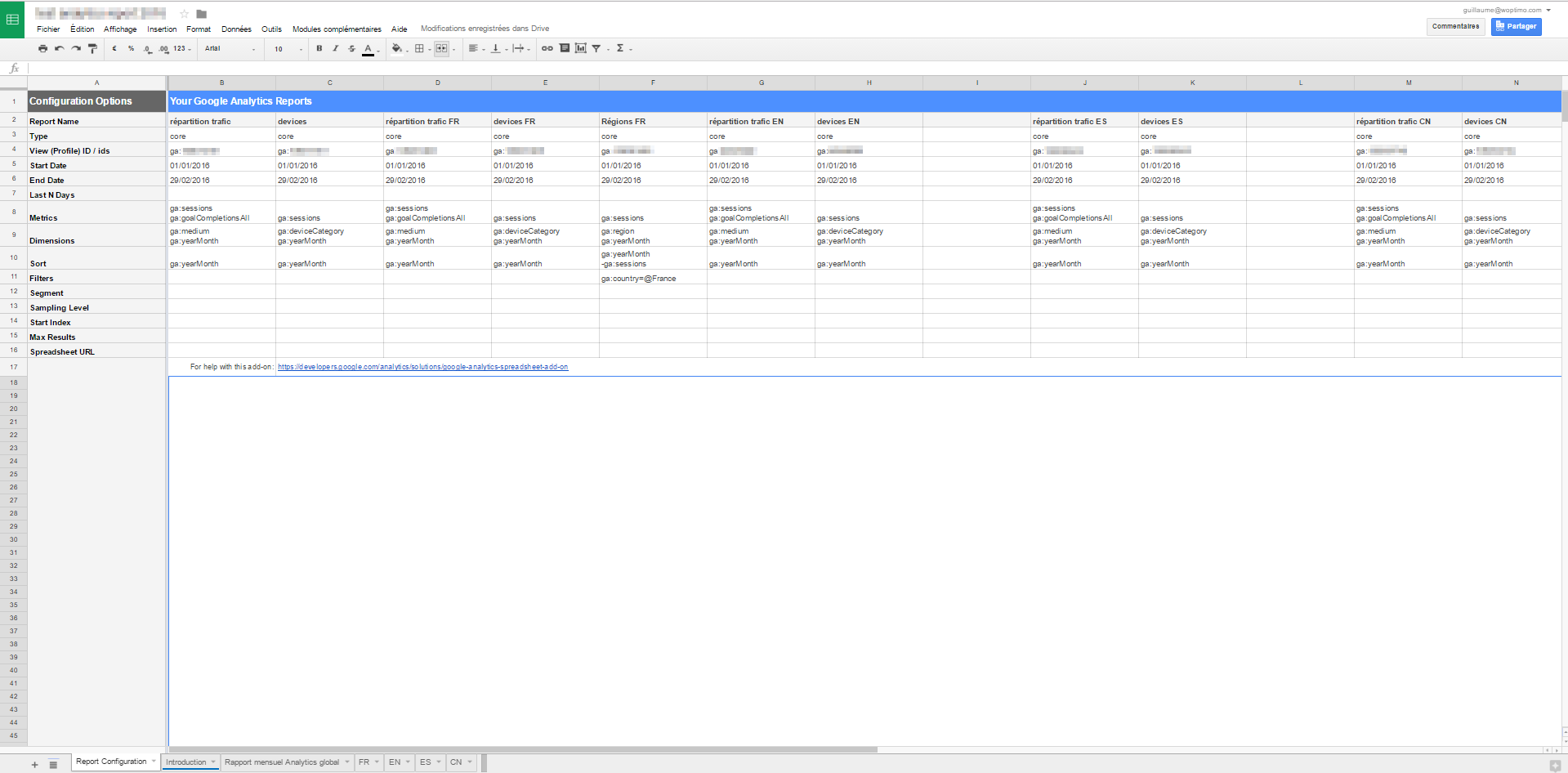
As you can see, I added different columns, each one with a new data sheet that I can use to extract the information I need. You can’t see it in the screenshot, but the end dates are dynamic – I used the formula =EOMONTH(today();-1) to show the end of previous month. You will notice that it is far easier to create reports directly from the columns than with the drop down list of the add-on.
You can compare several statistics and dimensions in each report. Each of them will create a new tab in Google Sheets with the desired information .
If you now click on “Run reports” in the add-on menu, this is what happens on one of those configured in my example:
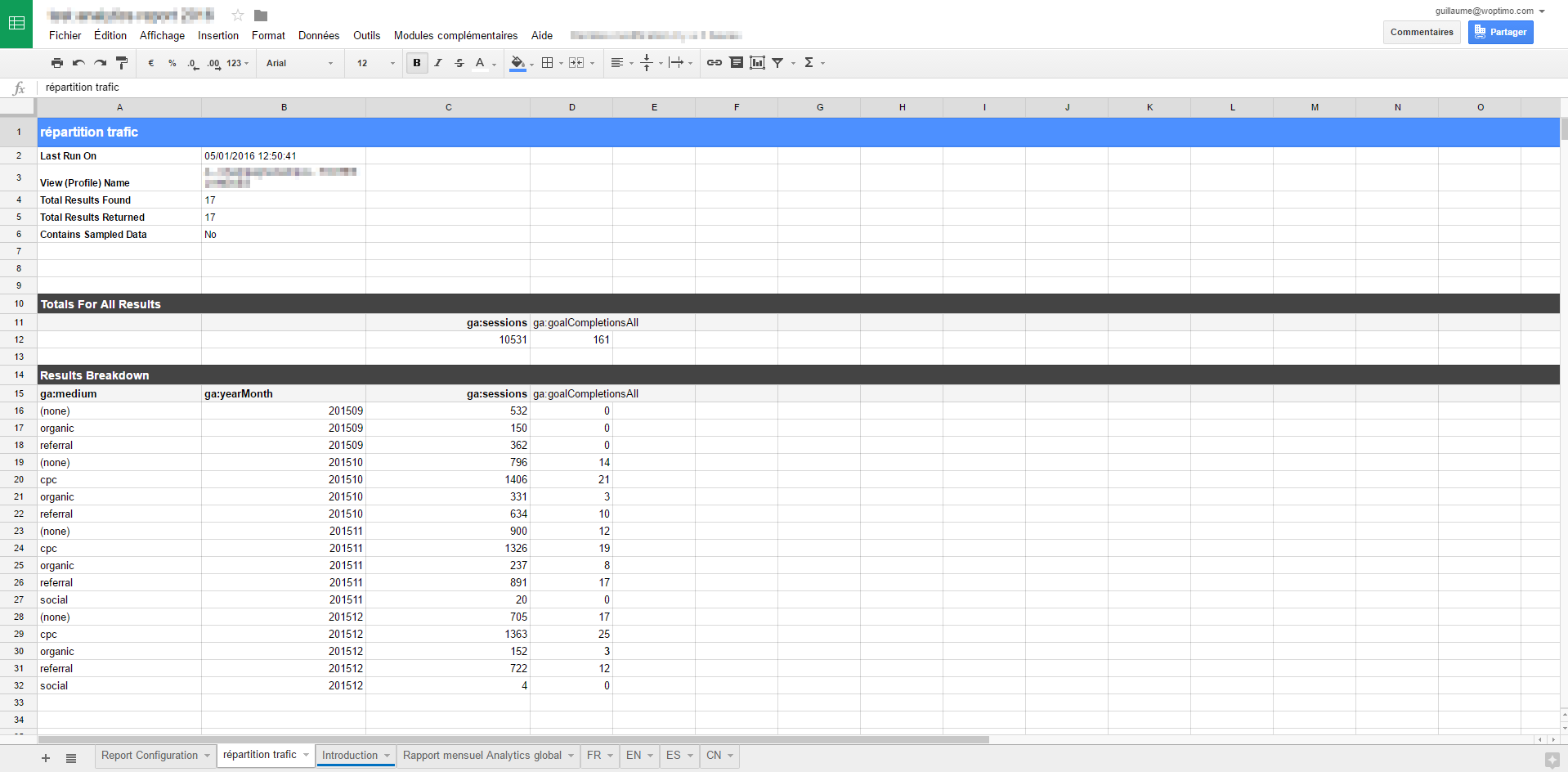
You can see which data I compared, for each month up to previous month, sessions and objectives by traffic source. This is raw data, we will then need to create an ergonomic view of the data.
3) Creation: Making data overviews “user-friendly”
View total traffic:
Use Google Sheets formula =sumif, which will allow to segment traffic under defined conditions E.g.:
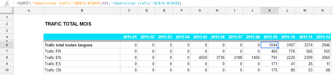
As we can see, we search all the traffic in the tab “répartition trafic” (traffic repartition), under the condition that it is in september 2015 (k4), no matter the acquisition channel. If you go up now to the screenshot before with the raw data, you will notice that the sum of all traffic sources for the sessions (column C) and for september only (column B) is correct. The advantage of this formula is that it can be expanded on other data easily.
View refined traffic:
To view only the direct traffic for the same month, you have to use a formula, which is an explosive cocktail based on different functions, “=INDEX” and “=MATCH” (adding iferror it’s only for “cosmetic” purposes) The formula searches in the same tab “répartition trafic” again.
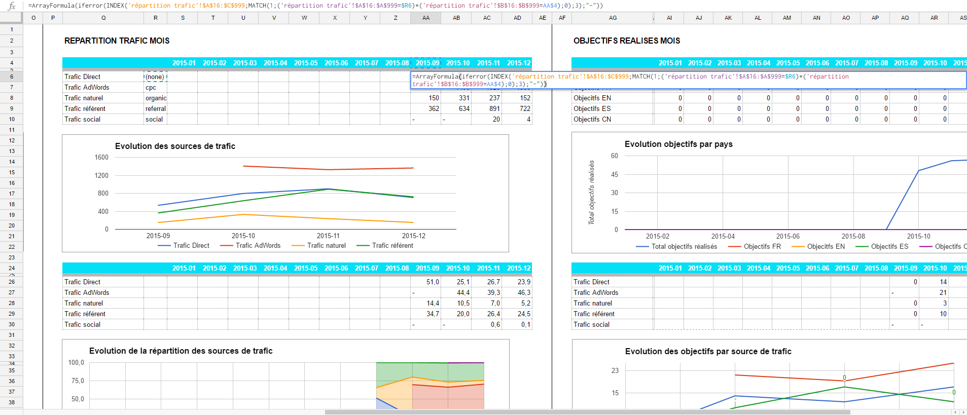
This formula is far more complex than the one before, but it replaces “vlookup” for the multi-criteria research in several data ranges. If you need more information, have a look at INDEX and MATCH on the Google Developers’ Guide.
To briefly resume the formula construction:
- By using MATCH, you display the column corresponding to both criteria – month and type of traffic (multiplying TRUE with TRUE results in “1” and MATCH will find the correct line number of this result). Using ArrayFormula help us to to do this search for a multiple database. So, we have this formula: =MATCH(1;(‘répartition trafic’!$A$16:$A$999=$R9)*(‘répartition trafic’!$B$16:$B$999=AB$4);0)
- INDEX gives us the result corresponding to the number of the line we were looking for before with MATCH, and column 3 (sessions), in the full raw database. Here is the complete formula, including the one before: =INDEX(‘répartition trafic’!$A$16:$C$999;MATCH(1;(‘répartition trafic’!$A$16:$A$999=$R9)*(‘répartition trafic’!$B$16:$B$999=AB$4);0);3)
In order to look for the goals achieved (and not the sessions), I took exactly the same formula and copied and pasted it later after changing column 3 to 4.
Now, you only have to draw the graph with the Google tool to display the evolution curve.
4) Reading: Update your data regularly and automatically
Once it’s done, the table will collect and show updated data automatically. You will get your data in only two clicks!
In order to view the new data on your report (as in my example at the beginning of the month, because it is a monthly report) just click on “Run reports”.
If you have set up your tabs accordingly, the raw data will be collected automatically, the tables will show up and the curves will be drawn.
If you click now on the button “Schedule reports” you can even set up an automated update for the time range you want (every day, week, month, on a specific time of the day). All you will have to do then is to open your Google spreadsheet.
Conclusion: Why use this method?
As we have seen, this method has a lot of advantages when you want to gather and view special data on a clear and ergonomic table. It is a tool regularly used by digital marketing specialists and CEOs (which is not that common for Analytics).
The first set up may take some time when setting up the formulas, graphs, the layout and all the rest.
But once you have it done, updating will be automated and you can continue to use it and view your reports even in the years to follow! You can even use it for other clients, accounts, activities because the data we will be looking for are often quite similar.
At Nubo, we often use dashboards that we used in the past, to put in place a new, more personalised one for particular clients.
By the way, it is very important to set up Google Analytics reports correctly and to make sure that there are no problems on your site. If you want further information regarding the configuration of Analytics or the follow-up on reports created by Nubo, take a look at our Google Analytics offers.